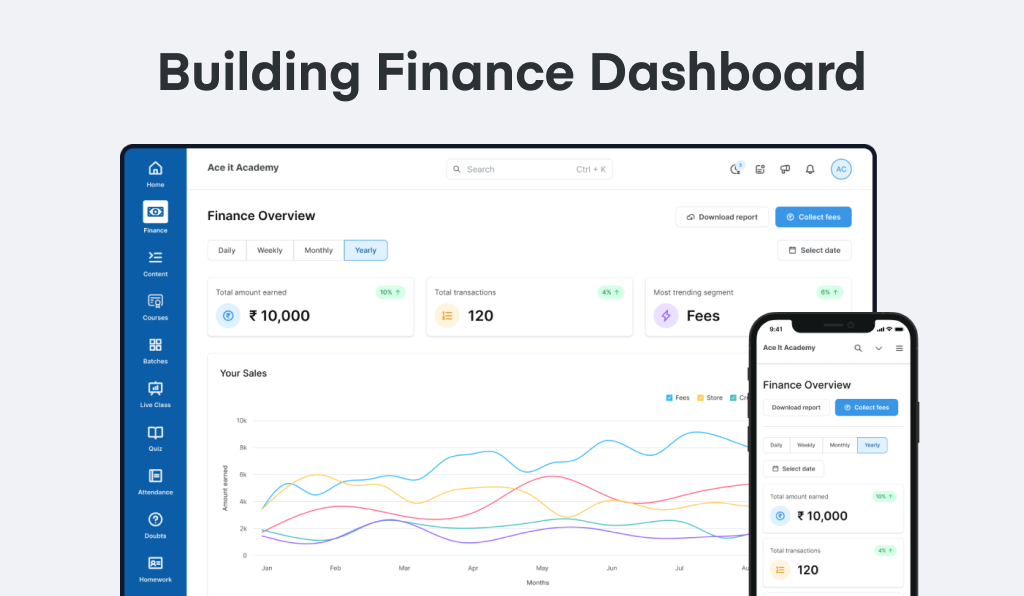
Problem Statement
• #1 - Tutors in small & midsize businesses were facing a hard time collecting fees from their students.
• #2 - The dashboard did not provide sufficient data to tutors on their finances and fees which impacted their ability to effectively manage their business and make informed decisions.
Project Outcomes
Quantitative evidence:
• Feature Adoption Rate: Improved from 30% to 50%
• Fewer queries & complaints from the customers
• Next steps: Introduce GST Invoicing Download for the transactions (an ongoing process)
Collect Fees Prototype
TL;DR | Don't want to read through everything? Have a look at the collect fees prototype that was designed. This is just one of the flows for this feature.
Challenges
• To design an aesthetic product feature on Fees Creation & Managing for Tutors
• To redesign & revamp the entire Fee Dashboard along with flows on Collecting and Managing Fees
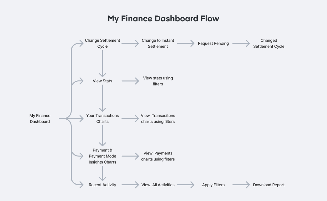
• Tutors & Coaching Institutes should have a complete view & analysis of how much they earn via fees & other different sources
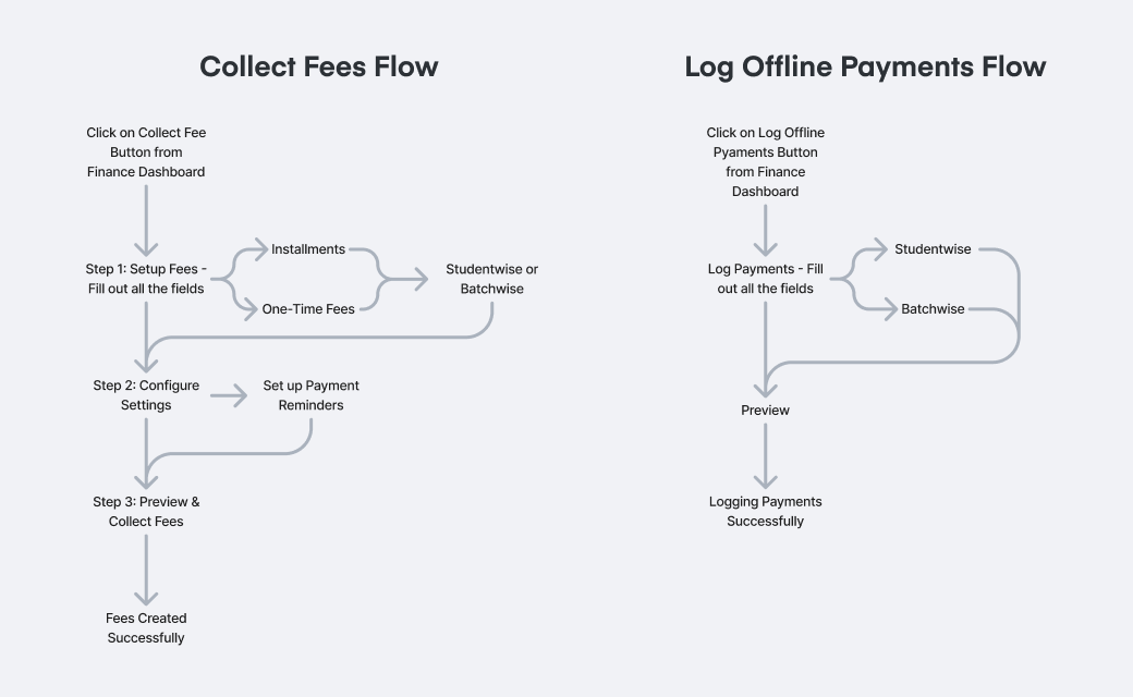
• Fees collection portal that can be used to set up and schedule collections by tutors
• A simplified flow for the tutors to collect fees.
Roles & Responsibilities
• Understand the flow used by the tutors to collect fees (both offline & online mode)
• Develop a solution that takes into account the business outcomes as well as limitations in conjunction with the PMs, developers, and other stakeholders
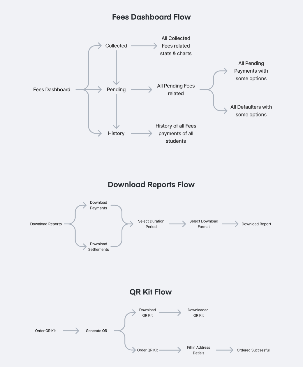
• Creating different user flows, simplifying the user journey to collect fees, and prototyping them
• Do usability testing with different stakeholders at the company on the prototype (dogfooding), gather feedback & iterate on the designs
• Ensure that the screens are designed according to the style guide and are properly handed off to developers
Project Timeline & Design Process
1. User Interviews & Research
• Based on the user calls, got to know that the process of the collection of fees via online methods had some friction & issues.
• From the data, got to know that the current experience was limiting.
2. Understand the problem
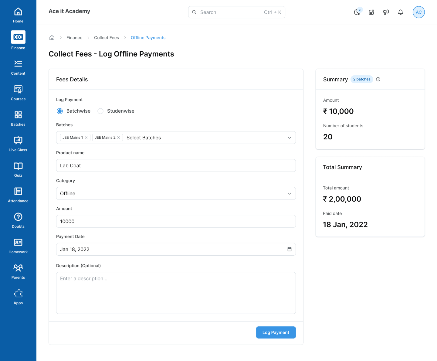
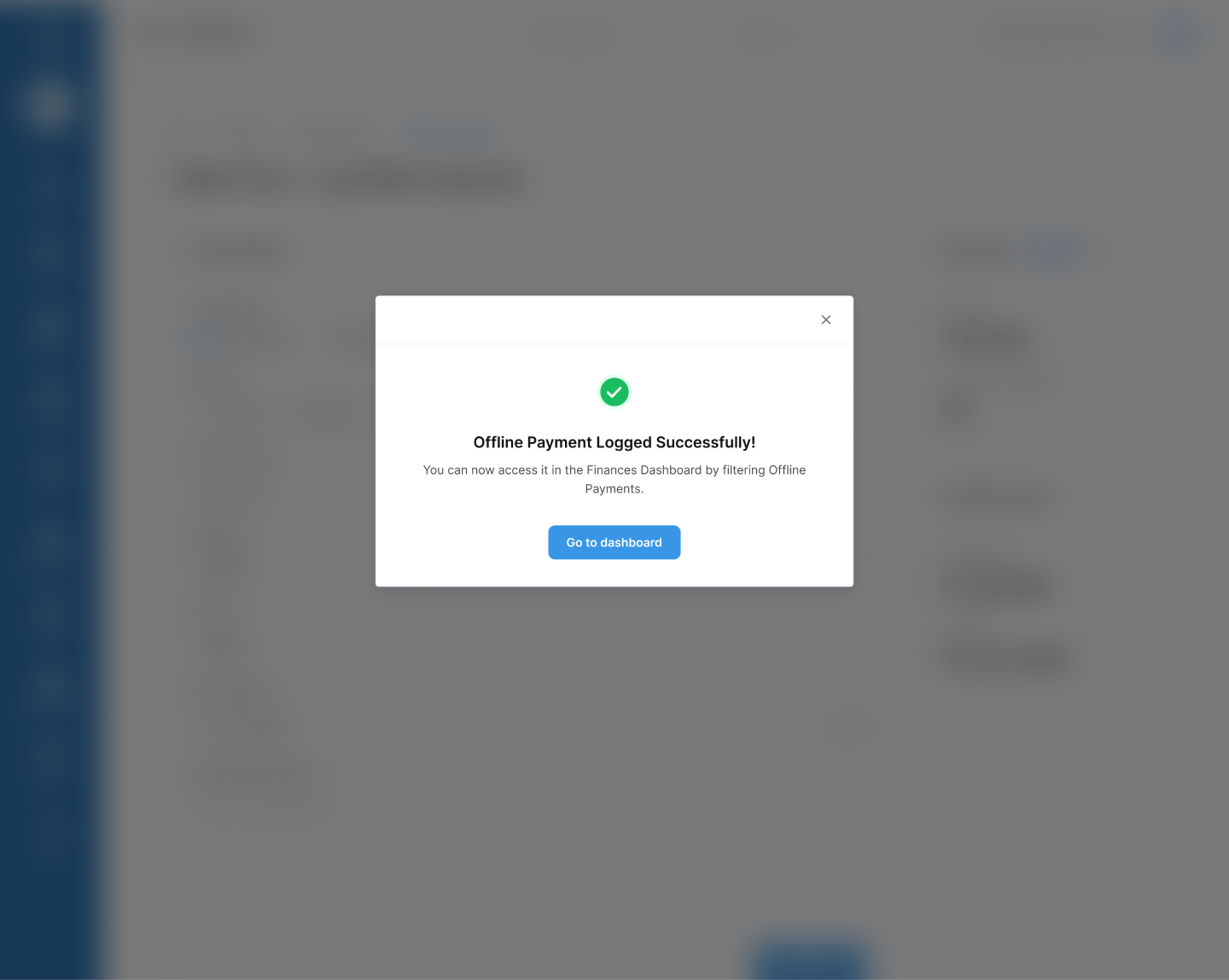
• Based on the research & interviews, it helped to arrive at the conclusion to make the collection of fees more efficient by simplifying the process. Also introduce logging of offline fees.
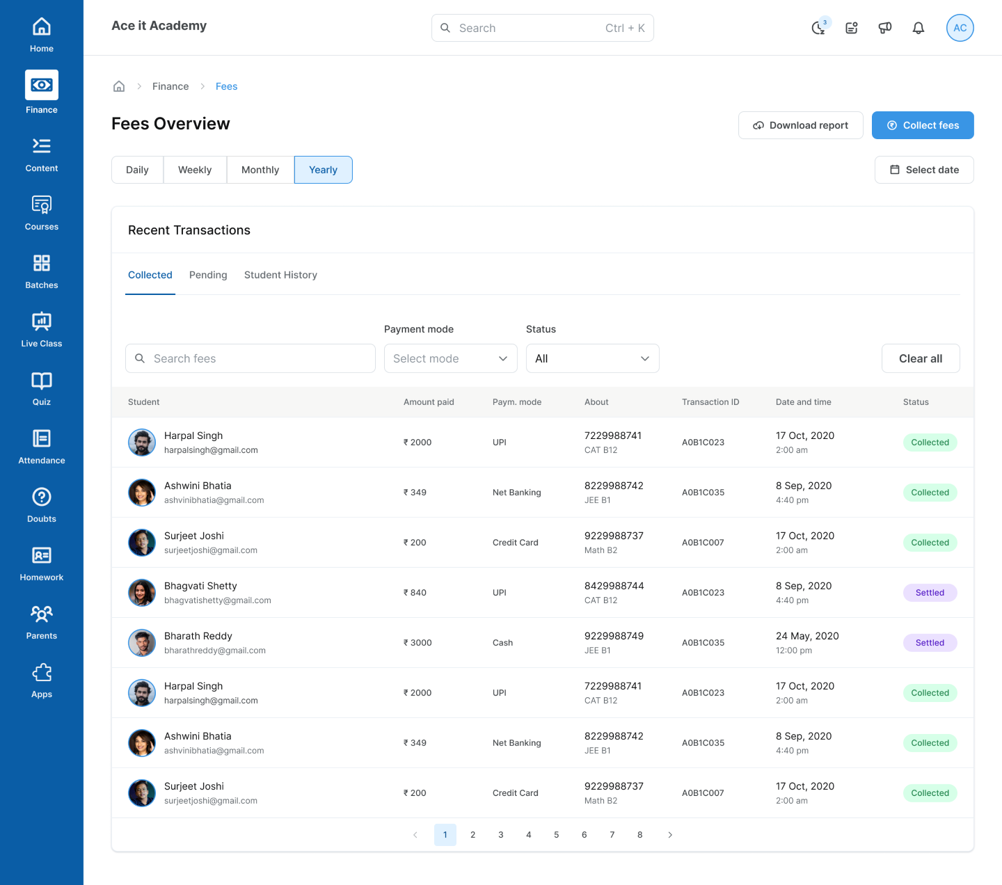
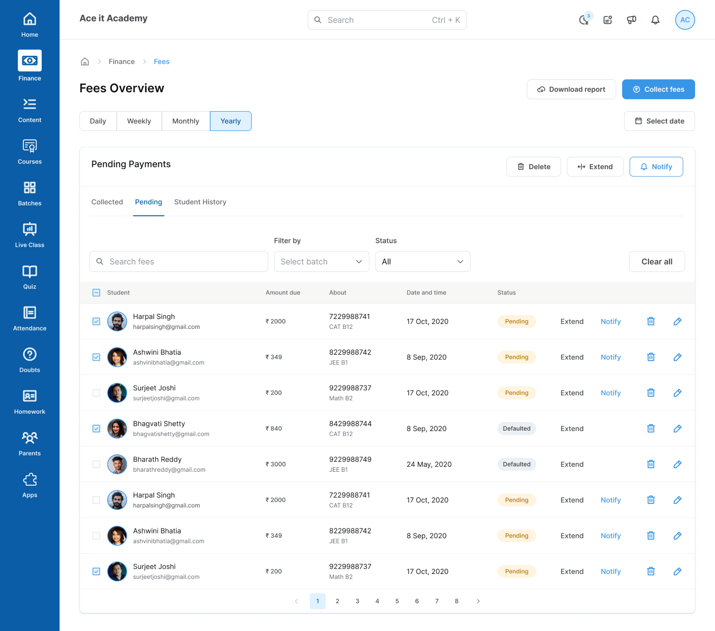
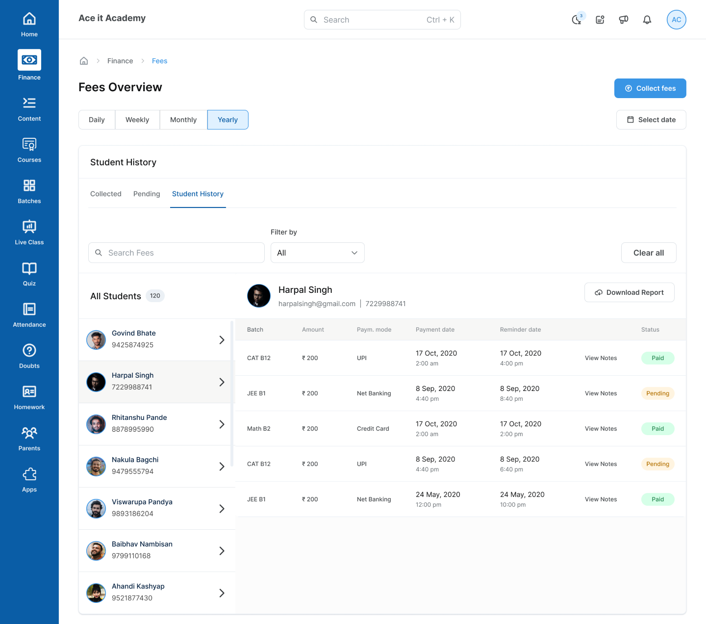
• Give a better representation & a detailed report to the tutors on the amount they have earned from all mediums via the My Finances Dashboard & Fee Dashboard. Also, give the functionality to download the reports.
3. UX Design - Flow & User Journey
4. Visual Design
Online Fees Flow Screens
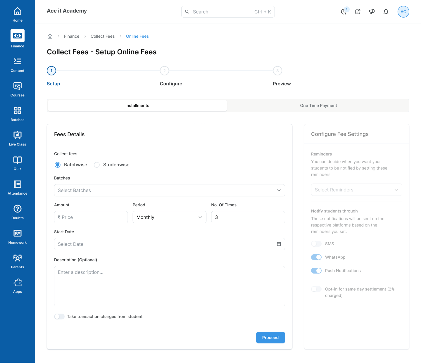
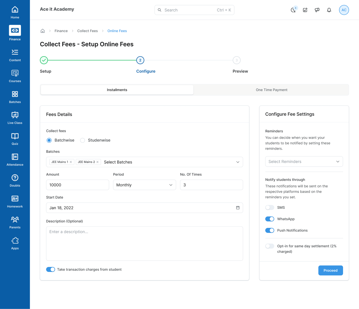
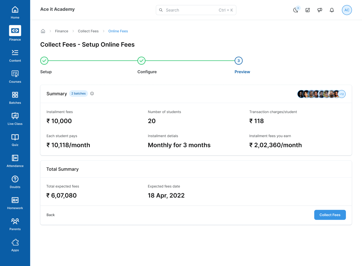
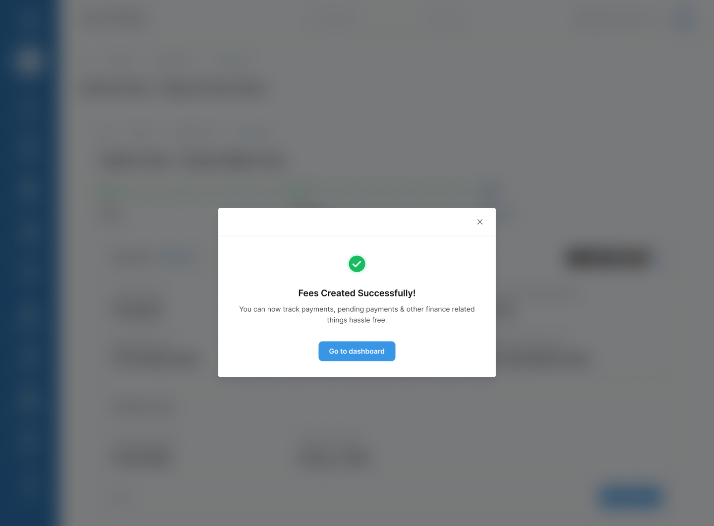
Offline Fees Flow Screens
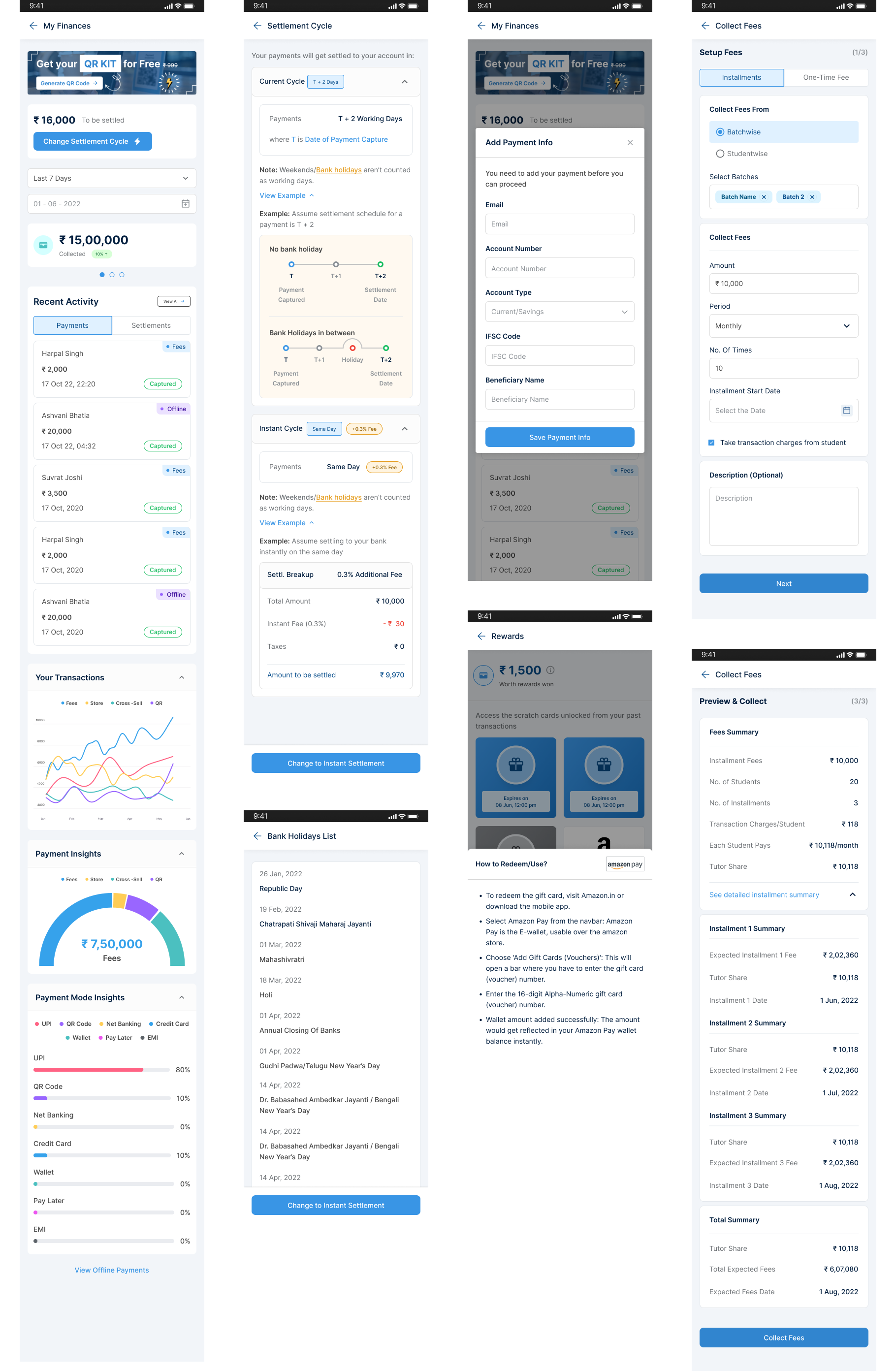
My Finances Dashboard Screens
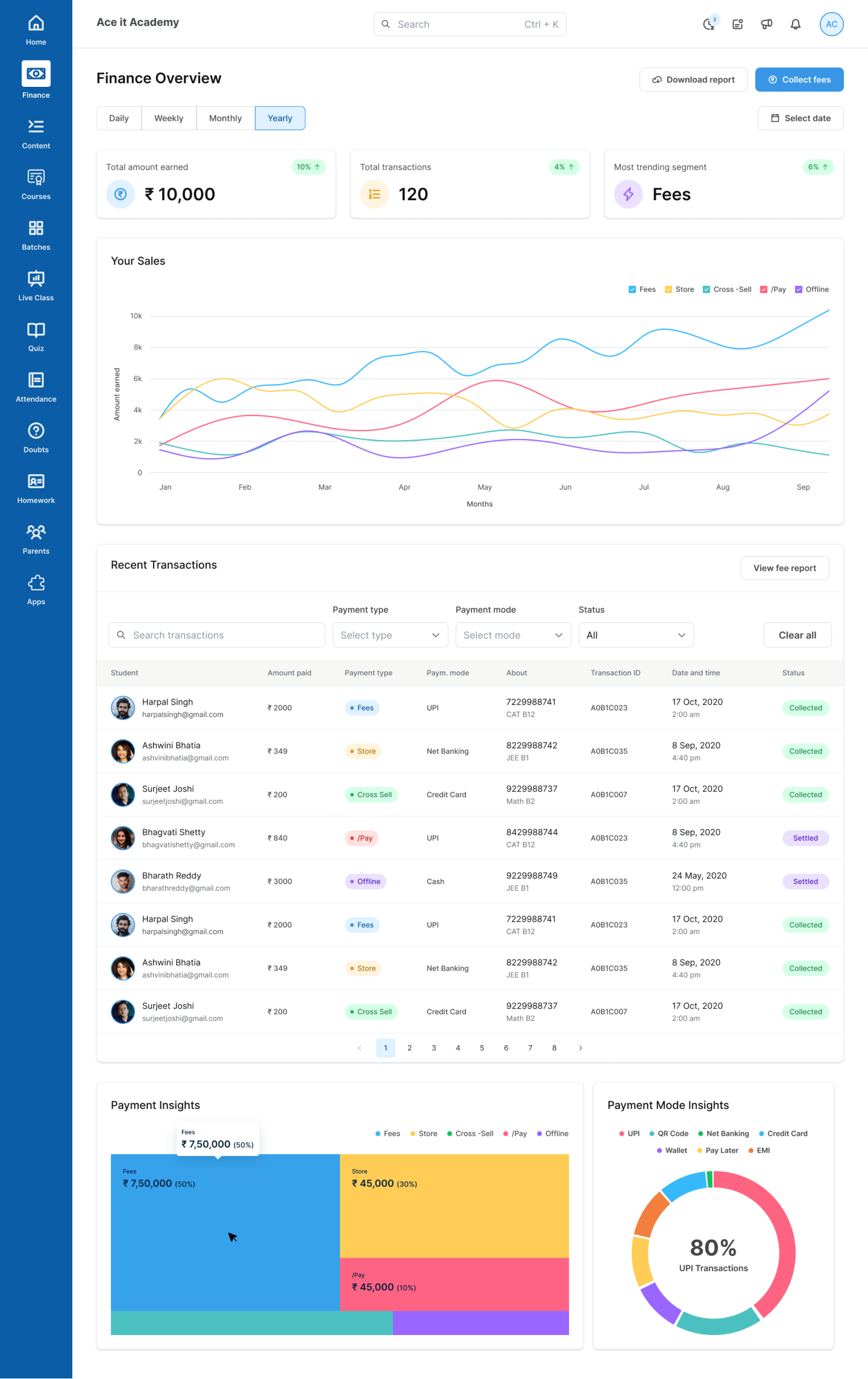
Fees Dashboard Screens
Some Android Screens
5. Prototyping important flows
Collection of Online Fees/Logging Offline Payments Prototype
Android Screens Prototype
6. Design Handoff
As of yet, the Design System has not been built. As a result, the developers received the entire Figma file alongside the prototypes.
7. Development & Implementation & 8. Product/Feature Release
Most of this phase was handled by developers, PMs, and other stakeholders. Nevertheless, I actively participated in explaining design decisions & mockups to all stakeholders when necessary.
Key Learnings
• Using constraints to design & improve your product - using what you have at your disposal
• Get rid of major pain points - provide the user with a well-designed process for completing the tasks
• Make it visually appealing - present the data in different formats using charts and easy-to-read charts
